Designing resource pages for the thumb, not the desktop mockup
Most discovery traffic arrives on small screens. A mobile-first layout forces the page to prioritize comprehension, touch targets, and reading flow.
On this page
A resource page that looks elegant at 1440px can still fail on the device that matters most: the phone in somebody's hand.
Start with one column
The mobile version should not feel like a compressed desktop layout. Start with the reading flow—title, summary, key points, content, next action—and only introduce sidebars when width actually creates useful space.
Keep the next action reachable
Buttons should have comfortable touch targets and avoid tiny inline links for primary actions. A full-width CTA on small screens is often clearer than a floating control.
Limit visual competition
A phone screen can show only a few ideas at a time. Use hierarchy rather than density: one strong headline, one summary, a small group of tags, then the next meaningful section.
Expand progressively
At tablet and desktop widths, cards can become grids, side context can become sticky, and related content can sit alongside the main article. The content model stays the same; only the presentation changes.
Keep reading
You may want these next
UI System
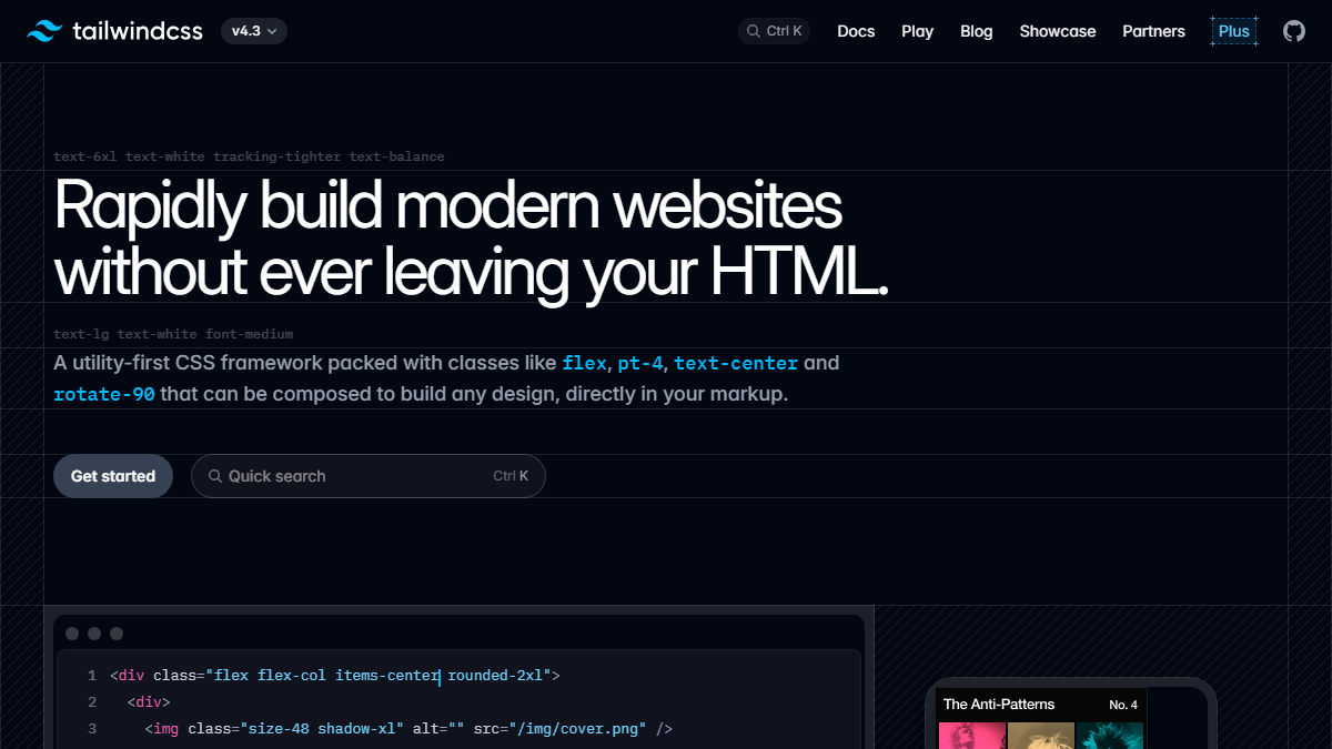
Tailwind CSS
A utility-first styling system that makes it practical to build one responsive interface instead of maintaining separate mobile and desktop versions.
ContinueUI Components
shadcn/ui
A practical reference for polished interface patterns when you want component code you can own and adapt rather than a black-box design system.
Continue