Tailwind CSS
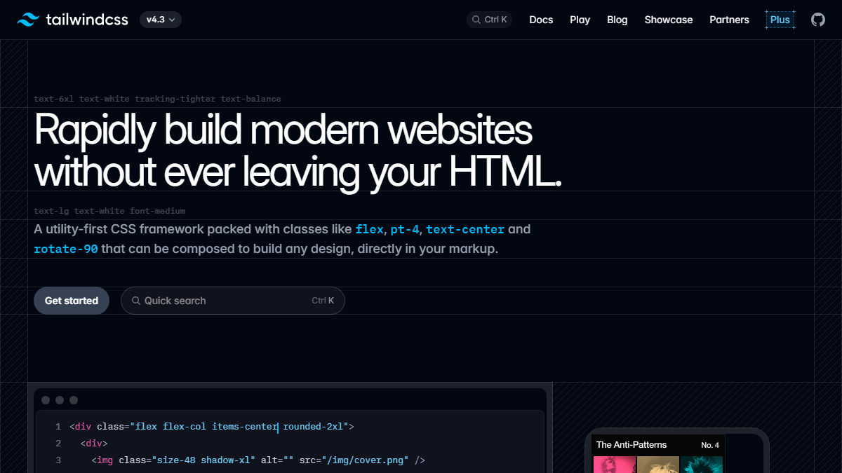
A utility-first styling system that makes it practical to build one responsive interface instead of maintaining separate mobile and desktop versions.
Useful for
- Teams building responsive design systems
- Developers iterating quickly on UI
- Projects with component-level styling
Why it is worth a look
- Mobile-first breakpoint workflow
- Consistent spacing and typography scales
- Easy to keep responsive rules next to components
Tailwind does not automatically create good responsive design, but it makes the rules easy to express in one place.
For this project the important pattern is simple: the base class describes the phone layout, and larger breakpoints progressively add columns, wider spacing, sticky context, and richer navigation.
Things to keep in mind
- • Class-heavy markup can become noisy without component discipline
- • A visual system still needs intentional design decisions
Links and downloads
External links and related documents
- SourcePrimary
Keep reading
You may want these next
Design
Designing resource pages for the thumb, not the desktop mockup
Most discovery traffic arrives on small screens. A mobile-first layout forces the page to prioritize comprehension, touch targets, and reading flow.
ContinueCuration
Collections should tell a story, not just filter a database
A good collection explains why items belong together, what order to explore them in, and which choice fits different kinds of users.
Continue